
Understanding color theory for clothing helps you create outfits that are visually balanced, striking, and expressive. By grasping the color wheel, you can pair complementary hues for bold looks or use analogous schemes for harmony. Knowing the role of warm and cool tones allows you to convey energy or calmness, matching colors to seasons or moods. To master style, explore how controlling contrasts and schemes can elevate your wardrobe—more insights await to enhance your fashion choices.
Key Takeaways
- Color wheel relationships guide outfit coordination through primary, secondary, and tertiary color combinations.
- Complementary colors create high-contrast, bold looks suitable for making statement outfits.
- Analogous and monochromatic schemes promote cohesive, harmonious ensembles with subtle variation.
- Warm tones evoke energy and passion, while cool tones convey calmness and sophistication.
- Combining neutral shades with bold accents enhances style through balanced, dynamic color choices.
The Basics of Color Wheel and Color Relationships
Understanding the color wheel is essential because it visually organizes colors based on their relationships, making it easier to create harmonious outfits. The wheel shows primary, secondary, and tertiary colors, highlighting how they connect. Using it helps you understand color harmony, which involves choosing colors that complement each other or create a pleasing balance. You’ll also see opportunities for color contrast, where contrasting hues make your outfits pop. For example, pairing warm and cool colors can enhance visual interest. By mastering these relationships, you learn how to combine colors confidently, whether for subtle coordination or bold statements. The color wheel acts as your guide, simplifying decisions and ensuring your clothing choices work together seamlessly. Additionally, understanding color relationships can improve your overall style and help you develop a cohesive wardrobe. Recognizing color harmony principles can further refine your choices and elevate your fashion sense. Developing an understanding of color contrast techniques can also add vibrancy and emphasis to your outfits.
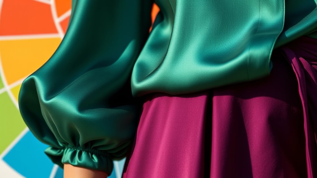
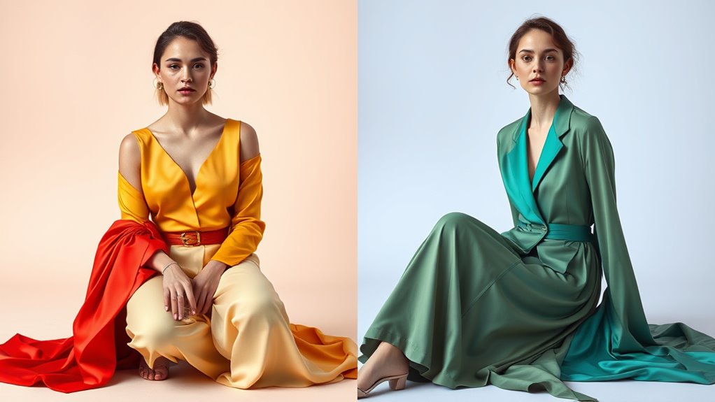
How to Use Complementary Colors for Impactful Outfits
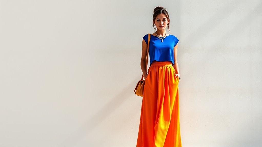
Complementary colors are a powerful way to create striking, eye-catching outfits. They provide high contrast, making your look stand out. To use them effectively, try color blocking with bold pairs like blue and orange or red and green. This technique draws attention and adds energy to your style. You can also incorporate complementary colors as accent colors—perhaps a bright yellow accessory against a purple outfit or coral shoes with teal clothing. Remember, pairing these hues in balanced proportions prevents overwhelming your look. Keep it simple: one dominant color with a complementary accent creates a fresh, vibrant appearance. Using color harmony principles can help you create balanced and visually appealing combinations that complement your personal style. Additionally, understanding visual balance can help you craft outfits that are both bold and harmonious, ensuring your look remains cohesive. Knowing how color contrast influences perception can further enhance your ability to design impactful outfits that truly stand out.
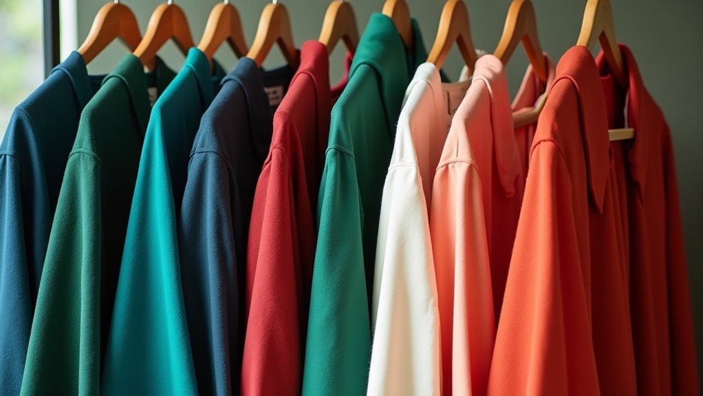
Creating Balance With Analogous and Monochromatic Schemes
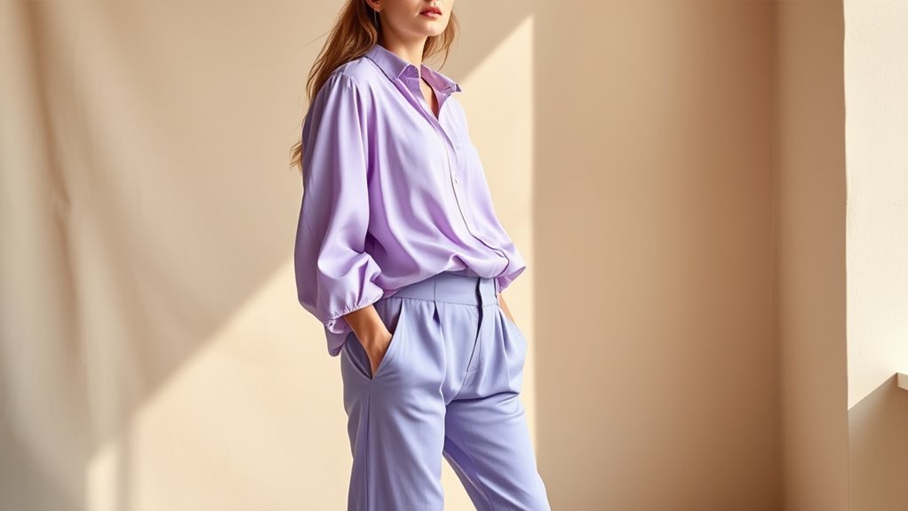
To create a balanced and harmonious outfit, you can use analogous and monochromatic color schemes that naturally complement each other. Analogous schemes involve colors next to each other on the color wheel, creating a smooth visual flow and enhancing color harmony. Monochromatic schemes focus on different shades, tints, and tones of a single color, providing a cohesive look that’s easy to style. Both approaches help you achieve a sense of unity without overwhelming the eye. When choosing these schemes, consider the mood and statement you want to make. Using similar tones ensures your outfit looks intentional and balanced, guiding the eye smoothly across your ensemble. Exploring color schemes can further enhance your understanding of how to build visually appealing outfits. Incorporating natural elements in your clothing choices can also promote a sense of tranquility and connection to the environment. Understanding relationship dynamics can also inspire you to experiment with different elements of style and customization, leading to more personalized fashion choices. Mastering these schemes allows you to build outfits that are visually appealing and effortlessly stylish.
The Role of Warm and Cool Tones in Fashion Styling
Warm and cool tones play an essential role in how your outfits convey mood and personality. Warm colors like reds, oranges, and yellows create energetic, inviting, and passionate looks, while cool tones such as blues, greens, and purples evoke calmness, professionalism, and serenity. Understanding seasonal color palettes helps you choose warm or cool shades that complement your skin tone and the time of year, enhancing your overall appearance. The psychological effects of colors influence how others perceive you; for example, warm tones can appear more approachable and lively, whereas cool tones often suggest sophistication and tranquility. Incorporating color harmony principles can further refine your outfit choices for maximum impact, especially when considering the water park environment and the vibrant colors often found there. Additionally, aligning your clothing colors with your personal energy can amplify your energetic alignment, making your style even more expressive and authentic.
Tips for Combining Colors to Enhance Your Personal Style

Combining colors effectively can instantly elevate your personal style and make your outfits stand out. To do this, consider color psychology to choose hues that reflect your mood or message. For example, blues evoke calmness, while reds convey energy. Experiment with seasonal color palettes to match your wardrobe to the time of year, enhancing harmony and freshness. Stick to complementary colors for contrast or analogous shades for a subtle, cohesive look. Don’t be afraid to mix neutrals with bold accents for balance. When in doubt, start with one statement color and build around it. Understanding color effects and how colors interact and influence perception can help you create outfits that truly express your personality and boost your confidence. Incorporating design thinking principles can further refine how you approach color combinations by emphasizing empathy and user experience in personal styling. Additionally, being aware of how color contrast impacts visual interest can help you craft more dynamic and appealing ensembles. Exploring visual perception can deepen your understanding of how different color arrangements influence overall aesthetics and viewer impressions.
Frequently Asked Questions
How Can Color Psychology Influence Clothing Choices?
Color psychology influences your clothing choices by shaping the color mood and emotional impact you want to convey. When you pick certain colors, you can boost confidence, calm nerves, or express excitement. For example, wearing red might energize you and grab attention, while blue can create a sense of calm. Being mindful of these effects helps you choose outfits that reflect how you feel and how you want others to perceive you.
Are There Universal Color Rules for All Skin Tones?
Imagine color rules as a guiding compass for your wardrobe. While there are no strict universal color rules, certain hues tend to enhance skin tone compatibility. Warm skin tones glow with earthy shades, while cool tones shine in jewel tones. Think of it as a dance—finding the perfect harmony between your skin and your clothing, creating a vibrant symphony that’s uniquely yours, regardless of the universal rules.
How Do Seasonal Color Analysis Systems Work?
Seasonal color analysis systems help you find the best colors for your skin tone by focusing on color harmony and palette selection. You identify whether you fit into a season—spring, summer, autumn, or winter—based on your natural coloring. This guides you to choose clothing colors that enhance your appearance, creating a balanced, harmonious look. It’s a personalized approach that makes selecting flattering outfits easier and more intuitive.
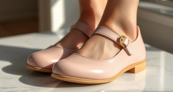
Can Color Theory Be Applied to Accessories and Footwear?
Imagine your accessories and footwear as the punctuation in your outfit’s story. Yes, you can apply color theory to accessories and footwear—think of them as the final brushstrokes that enhance your look. Color matching and accessory coordination become easier when you understand complementary and analogous colors. This approach helps you create harmony or a striking contrast, making your entire ensemble more cohesive and visually appealing.
What Are Common Mistakes to Avoid When Mixing Colors?
When mixing colors, you should avoid clashing or creating disharmony in your outfit. Stick to color harmony principles, like complementary or analogous palettes, to make certain your look is balanced. Be cautious with contrasting palettes that can overwhelm your style. Don’t forget to take into account your skin tone and setting. By paying attention to these details, you’ll create cohesive, stylish outfits without making common mistakes that disrupt your overall look.
Conclusion
Remember, clothes can speak before you do. By understanding color theory, you’ll confidently choose combinations that highlight your style and personality. Play with complementary, analogous, and monochromatic schemes to create eye-catching outfits. Warm and cool tones add depth and mood, helping you stand out effortlessly. As the saying goes, “Fashion fades, but style is eternal.” Embrace these principles, and let your wardrobe reflect your unique essence with every outfit you wear.